FABLE VARIABLE OTF
typeface design
glyphsFor scrolling and surfing and snoozing—without the squinting.
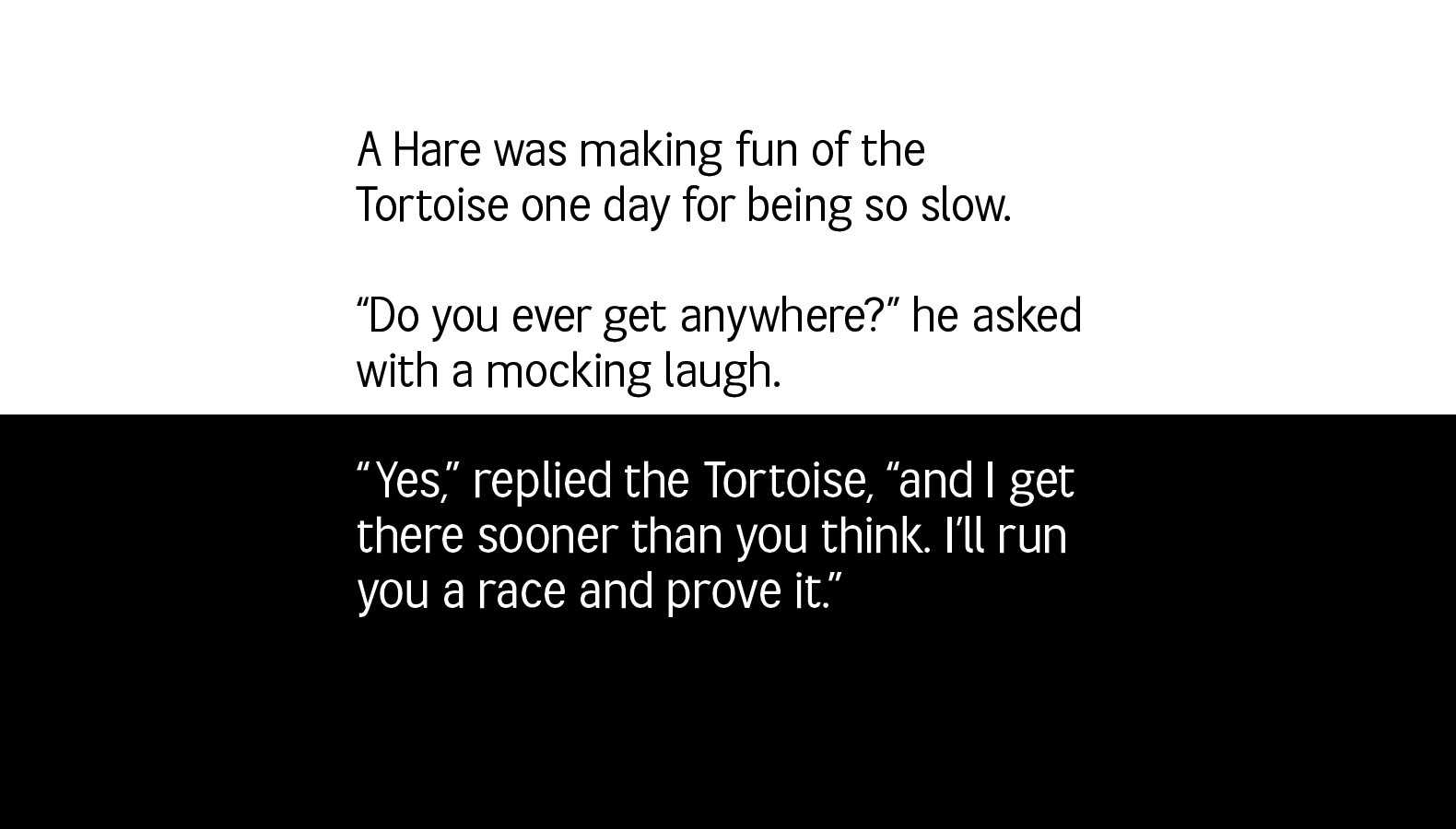
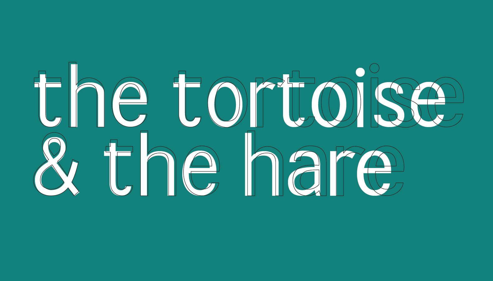
Fable is for stories and threads and columns and read mores. For doing the things you want to do when you want to do them. Tooled with deliberate optical size adjustments to compliment both standard screens and their nightmode equivalents.
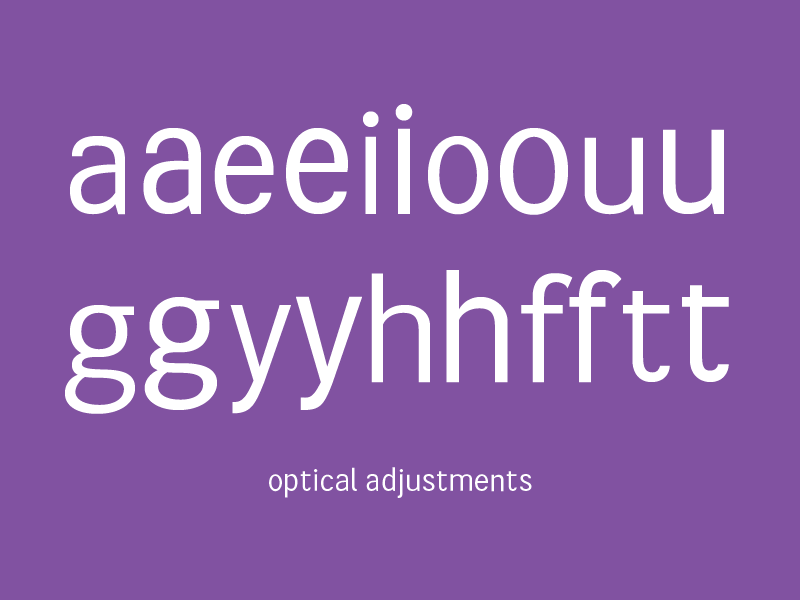
Within Fable there are subtle shifts between both sets of masters, specifically with the x-height. This allows you to have more control of where the x-height will sit within your own projects. Additionally there are slight shifts in the sizing of bowls and stems, allowing type to stand on its own as knockout text.
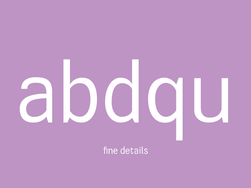
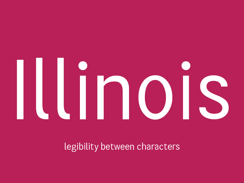
Care and attention led to specific differences between characters in order to differentiate between them. Since Fable is a digital variable font, focus went into characters that are easily mixed up at small sizes, leading towards l’s and t’s with tails, as well as doublestory a’s and g’s.
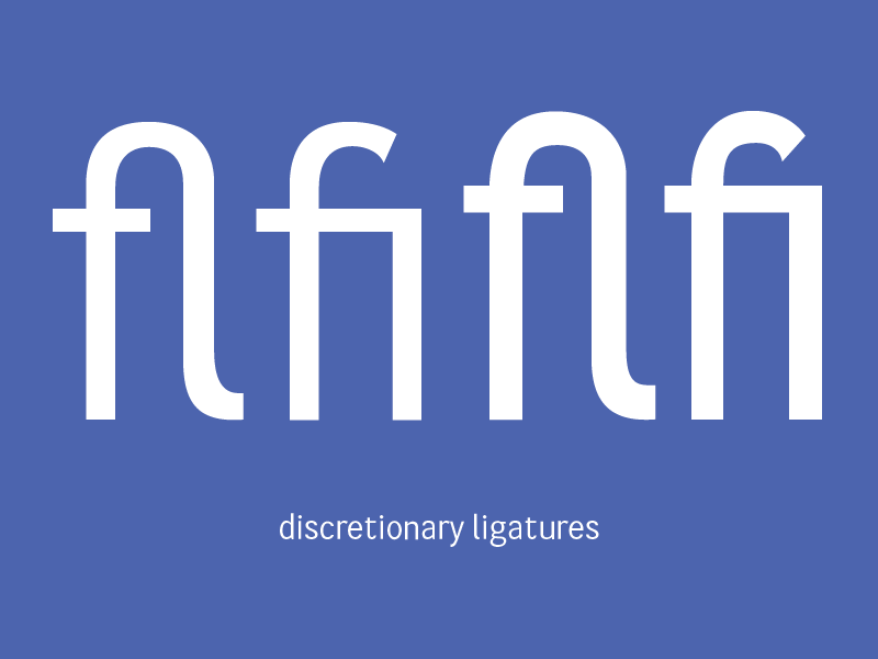
Tight confusing letter spacing is something I set out to avoid, and what’s a better way to avoid that than with ligatures? Now under no circumstances will your f’s collide with the next letter, and they'll look fashionable while doing so.
With the basic design of each glyph, fine details were parsed to make sure everything was legible in both “daytime” and “nighttime” modes.